Charities trade on their reputations and we ask people to trust us with their money, their time, or their concerns. For them to feel secure in doing that we must build confidence in every way that we can. Our User Experience Architect, Kate Roberts, gives her top ten tips for building trust in your digital.
35% of the public has low levels of confidence in charities, according to a recent report by think-tank New Philanthropy Capital (NPC) and Ipsos Mori[1]. This is a serious problem, and one which must be addressed strategically and across the sector. If your organisation is working hard to inspire trust then it’s important that your digital presence builds confidence. Your reputation and your income depend on your audience’s belief in your professionalism and ability to deliver so this is an investment that should deliver a positive return.
Trust is a key factor of the online user experience for the commercial and charitable sector alike. If a user does not trust a website, they won’t want to share their information, make a payment, or follow a call-to-action.
As Chad Vavra wrote recently in UX Magazine[2]: “Good experiences are ones that don’t distract us from the flow, and flow happens when we aren’t questioning if we should trust what we’re seeing, hearing, or doing.”
E-commerce sites can use security seals and protocols like SSL; but how can a non-profit website gain the user’s trust? Here are our top ten tips.
- Invest in design
An attractive website conveys professionalism and competence. Whilst donors don’t want their money ‘wasted’ on flashy web design, good design needn’t be expensive.
Researchers at Stanford’s Persuasive Technology Lab[3] found that design was the most commonly-mentioned factor in people’s evaluations of website credibility. You don’t need to use fancy technology, but you do need to understand elements like layout, typography, white space, images and colour schemes.
Trust, security and reliability is often associated with the colour blue. Colour psychology isn’t an exact science, and plastering your site with blue won’t automatically make it appear trustworthy, but PayPal, Yahoo Finance and MoneySupermarket all use a lot of blue in their design.
- Stick to conventions
Users rely on conventions to help them interact with websites (e.g. navigation is usually across the top; links usually look different to normal text). When things function as expected, users get a sense of familiarity and comfort.
Of course, creativity often means stretching and breaking the rules; and those of us who work in digital are delighted when we come across an innovative approach to navigation or a clever use of parallax scrolling.
But there’s a time and a place for experimentation. Many charity websites have audiences that skew older and may lack technical literacy: if something doesn’t work as expected, they’re likely to feel confused and frustrated, and lose trust in the website.
- Tell users what’s going on
Think about how unnerving it would be to click ‘Purchase’ on an e-commerce site and see nothing but a blank screen. Has your payment been taken? Has your order gone through? What happens now?
Whenever a user takes an action on your site, they need feedback: confirmation that the action has been completed, and an indication of what will happen next.
- Keep it snappy
Slow page load time has a negative effect on credibility, as proved by a study at Stanford University[4]. There are plenty of free speed test tools out there, and Google Analytics has a site speed report. Optimise your images, avoid unnecessary plugins and multiple tracking scripts, and keep your CMS software up to date.
- Don’t use dark patterns
‘Dark patterns’ are user interfaces designed to get people to do something that they don’t necessarily want to do – for example, Royal Mail’s online forms default users into receiving communications, and require them to tick four boxes to opt out.
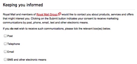
We’ve seen users become borderline enraged by websites that seem to ‘trick’ them into signing up for communications. Keep default options to the ones you think the user will want, and don’t opt them into anything unless they’ve actively read and ticked the appropriate statement.
- Show how you’re helping
Every charity knows the power of case studies. Supporters want to know that their money is making a difference, and individual stories are more impactful than facts and figures.
Of course, it’s difficult to gather case studies – especially for UK charities whose beneficiaries may be understandably reluctant to see their personal struggles plastered across a website.
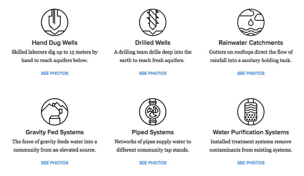
But you don’t have to show real people: real things can tell stories too. Charity:Water sketches each solution to the water problem with a few words, and links to photos of that solution in real life.
- Make it easy to contact you
Yes, dealing with enquiries is resource-intensive – but it’s also an opportunity to build engagement and loyalty. We’ve found that the most positive user feedback often concerns a charity’s helpline staff.
On the other hand, ‘uncontactability’ causes frustration and damages trust. According to the Content Marketing Institute[5] 55 percent of people agree that lack of contact information reduces an organisation’s credibility.
A contact form is easier for users who don’t want to open their email client, and can allow you to send enquiries automatically to the relevant department. But it has some disadvantages over simply providing an email address:
- Users have to fill in more information.
- If the user mistypes their contact details, you have no way of contacting them.
- The user doesn’t have a copy of their message for their own reference.
- Be transparent about admin costs
You don’t have to show a pie chart whose ‘admin’ wedge risks dismaying users. Instead, take the opportunity to explain your work. Joe Saxton, founder of nfpSynergy, said: “It would be a brave charity that stuck its neck out as the first to shout about this information, but surely it’s time for the sector as a whole to try. People don’t really understand how charities work and this is a missed opportunity to innovate and help them become better informed.”
For many users, your data will be a pleasant surprise. On average, people estimate that charities spend 37% of their income on admin costs[6]: more than three times the real figure.
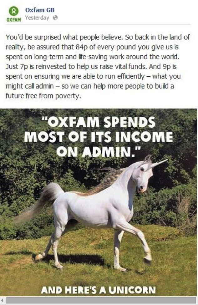
Oxfam addressed this issue by talking clearly, confidently and with a touch of humour about its admin costs in this Facebook post:
- Be transparent about staff salaries
The NCVO recommends[7] that larger charities publish – in an easily accessible place on the website – the salaries of senior executives, and a summary of the trustees’ rationale in deciding those salaries.
Concern Worldwide has a section called ‘Transparency’ at the second level of its website, which shows charts of key financials, discusses trends in the transparency debate, and provides information that justifies their CEO’s salary.
- Show some personality
Consider your brand tone of voice. Do you get angry about injustice, or focus on the positive? Are you a supportive and calming presence, or a high-energy trailblazer? These ‘personality traits’ can inspire identification and trust in the same way that people’s personalities can.
Help users to connect to the people behind the website. Put staff profiles on the ‘About’ page, give employees an individual voice in blogs, or encourage volunteers to post their experiences on social media.
Conclusion
Digital has become the front door for most charities, the place where those we engage with can get the broadest view of who we are and what we do. As organisations we trade on our reputations and ask people to trust us with their money, their time, or their concerns. For them to feel secure in doing that we must build confidence in every way that we can.
There are many innovative ways that digital can enhance transparency, for example by using technology to map your work and make your impact clear – but it’s vital to get the basics right. Those who invest in inspiring trust, and who do the hard work to make the decisions easy for their users, will reap the benefits in terms of engagement and support.
Questions or comments?
We’d love to hear your thoughts so please do comment or, if you have any direct questions or want to talk to us about user research, do drop us a line.
References
[1] http://www.theguardian.com/voluntary-sector-network/2014/oct/28/public-trust-in-charities-low-but-local-ones-do-better-npc-report?CMP=new_1194
[2] http://uxmag.com/articles/trust-in-experience-design
[3] http://www.itu.dk/~rgsindberg/UA-eksamen/U%20Slides/Artikel%20med%20brugerevaluering.pdf
[4] http://www.webstrat.fr/sites/www.webstrat.fr/files/Stanford-MakovskyWebCredStudy2002-prelim.pdf
[5] http://contentmarketinginstitute.com/2014/04/potential-b2b-buyers-website-content-trust/
[6] http://nfpsynergy.net/press-release/public-thinks-charity-spending-admin-more-double-their-acceptable-level
[7] http://blogs.ncvo.org.uk/2014/04/29/transparency-will-help-maintain-trust-in-charities/